How to Turn Time Series Data into Stunning Clock-Like Polar Plots
Have you ever heard of “Google Trends”? Google Trends is a fascinating tool that lets you explore trending search terms on Google. You can compare different terms and see their popularity over time, which opens the door to some intriguing analyses.
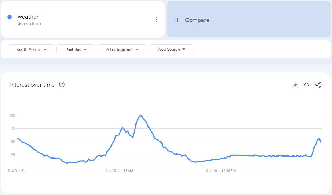
Last week, I was browsing the trending now page and noticed something surprising: the search term “weather” was trending. Weather? People actually Google the weather? Out of curiosity, I clicked on the “weather” search page and discovered that in South Africa, the term peaks around 6:00 AM. How intriguing! But it got me thinking—how does Google visualize this data for us?

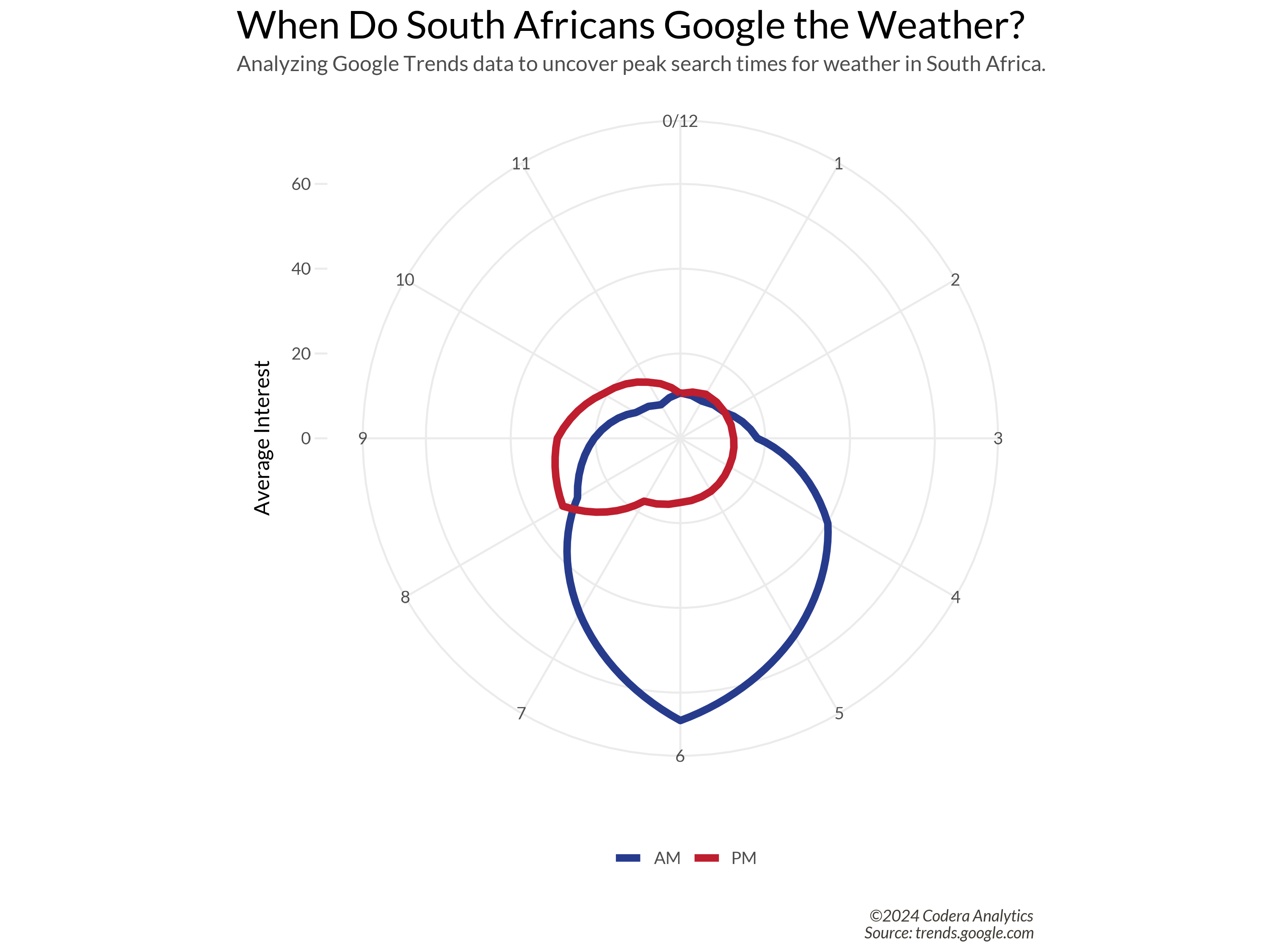
Not bad at all! This visualization gives a decent sense of when the term’s peaks occur. But here’s a thought: what’s the most universally recognized way we interpret time? A clock! That familiar thing we once stared at in school, counting down the minutes until the weekend. Wouldn’t it be amazing if we could reimagine this data as a clock? Let’s give it a shot!
If you want to try this yourself, you can download the data here. Once downloaded, let’s take a look at what we’re working with:
read.csv(file.path(DATA_RAW_DIR, "weather_trends.csv"), skip=2) %>%
  janitor::clean_names()
# A tibble: 169 × 2
   time          weather_south_africa
   <chr>                        <int>
 1 2024-12-02T19                   18
 2 2024-12-02T20                   31
 3 2024-12-02T21                   28
 4 2024-12-02T22                   20
 5 2024-12-02T23                   15
The dataset has a time column, formatted as a character string in year-month-day-hour format (24-hour time). The weather_south_africa column is already an integer, so all that’s needed is some renaming.
Let’s begin by converting the time column to a proper datetime format. After that, we’ll add an am_pm column to indicate whether the time is in the morning (“AM”) or afternoon/evening (“PM”). Finally, we’ll calculate the minute_hand_position by taking the hour modulo 12 and multiplying it by 5. Let’s see how this works:
read.csv(file.path(DATA_RAW_DIR, "weather_trends.csv"), skip=2) %>%
  tibble() %>%
  janitor::clean_names() %>%
  mutate(
    # Step 1: Parse as datetime
    time = ymd_h(time),
    # Step 2: Determine AM or PM
    am_pm = ifelse(hour(time) < 12, "AM", "PM"),
    # Step 3: Calculate the minute hand position
    minute_hand_position = (hour(time) %% 12) * 5
  )
# A tibble: 169 × 4
   time                weather_south_africa am_pm minute_hand_position
   <dttm>                             <int> <chr>                <dbl>
 1 2024-12-02 19:00:00                   18 PM                      35
 2 2024-12-02 20:00:00                   31 PM                      40
 3 2024-12-02 21:00:00                   28 PM                      45
 4 2024-12-02 22:00:00                   20 PM                      50
 5 2024-12-02 23:00:00                   15 PM                      55
Taking the first row as an example:
- The time is 19:00:00.
- The
am_pmcolumn correctly indicates “PM” ✅. - The
minute_hand_positioncolumn is calculated as 35 ✅.
Skimming through the rows confirms everything looks great!
Since the data spans the last week, it provides enough detail for averaging purposes. Unfortunately, extending the data further back would mean losing the hourly resolution. I tried a few libraries and open-source projects to address this, but none worked as expected. If you find a library that integrates well with Google Trends, please leave a comment!
Next, we’ll aggregate by minute_hand_position and am_pm to calculate the mean interest level. Since deviations aren’t extreme, the mean should work well:
read.csv(file.path(DATA_RAW_DIR, "weather_trends.csv"), skip=2) %>%
  tibble() %>%
  janitor::clean_names() %>%
  mutate(
    time = ymd_h(time),
    am_pm = ifelse(hour(time) < 12, "AM", "PM"),
    minute_hand_position = (hour(time) %% 12) * 5
  ) %>%
  select(-time) %>%
  rename(interest = weather_south_africa) %>%
  group_by(minute_hand_position, am_pm) %>%
  summarize(average_interest = mean(interest)) %>%
  ungroup()
# A tibble: 24 × 3
   minute_hand_position am_pm average_interest
                  <dbl> <chr>            <dbl>
 1                    0 AM                10.7
 2                    0 PM                10.6
 3                    5 AM                10.1
 4                    5 PM                12
 5                   10 AM                12.1
This gives us 24 rows, as expected (12 each for “AM” and “PM”). However, to create a full circular plot, we need to duplicate rows for minute_hand_position == 0 as minute_hand_position == 60 and vise versa. This completes the “clock”. If this sounds confusing, trust the process for now. Press the “I believe button”. Here’s the final data cleaning pipeline:
df_weather_trend <- read.csv(file.path(DATA_RAW_DIR, "weather_trends.csv"), skip=2) %>%
  tibble() %>%
  janitor::clean_names() %>%
  mutate(
    time = ymd_h(time),
    am_pm = ifelse(hour(time) < 12, "AM", "PM"),
    minute_hand_position = (hour(time) %% 12) * 5
  ) %>%
  select(-time) %>%
  rename(interest = weather_south_africa) %>%
  group_by(minute_hand_position, am_pm) %>%
  summarize(average_interest = mean(interest)) %>%
  ungroup() %>%
  bind_rows(filter(., minute_hand_position == 0) %>% mutate(minute_hand_position = 60)) %>%
  bind_rows(filter(., minute_hand_position == 60) %>% mutate(minute_hand_position = 0))
Nothing like clean data! We’re 70% there! Now for the fun part.
p <- df_weather_trend %>%
  ggplot() +
  geom_line(aes(
    x = minute_hand_position,
    y = average_interest,
    color = am_pm
  ), size = 2) +
  coord_polar() +
  expand_limits(y = c(0, 60)) +
  scale_y_continuous(breaks = seq(0, 100, 20)) +
  scale_x_continuous(breaks = seq(0, 60, by = 5), labels = c(0:12)) +
  scale_color_manual(values = c(CODERA_BLUE, CODERA_RED)) +
  theme(
    axis.title.x = element_blank(),
    legend.position     = "bottom",
  ) +
  labs(
    title = "When Do South Africans Google the Weather?",
    subtitle = "Analyzing Google Trends data to uncover peak search times for weather in South Africa.",
    y = "Average Interest",
    color="",
    caption = paste0(
      "©", format(Sys.Date(), "%Y"), " Codera Analytics" ,
      "\n",
      "Source: trends.google.com"
    )
  )
The resulting plot is a fascinating visual! It reveals two peak times when South Africans Google the weather: one in the morning at 6 a.m. and another in the evening at 8 p.m. Ha ha. This might suggest that most South Africans plan their outfits for the day in the morning, while some prefer to prepare the night before.
