My Favorite Plots of 2024 and the Journey Behind Creating Them
It’s that time of the year where Spotify releases their Spotify Wrapped. I’ve made about 18 plots in 2024 and decided to have my own reflection on my favorite plots and the journey behind them.
Where are Cape Town’s most expensive Airbnbs?
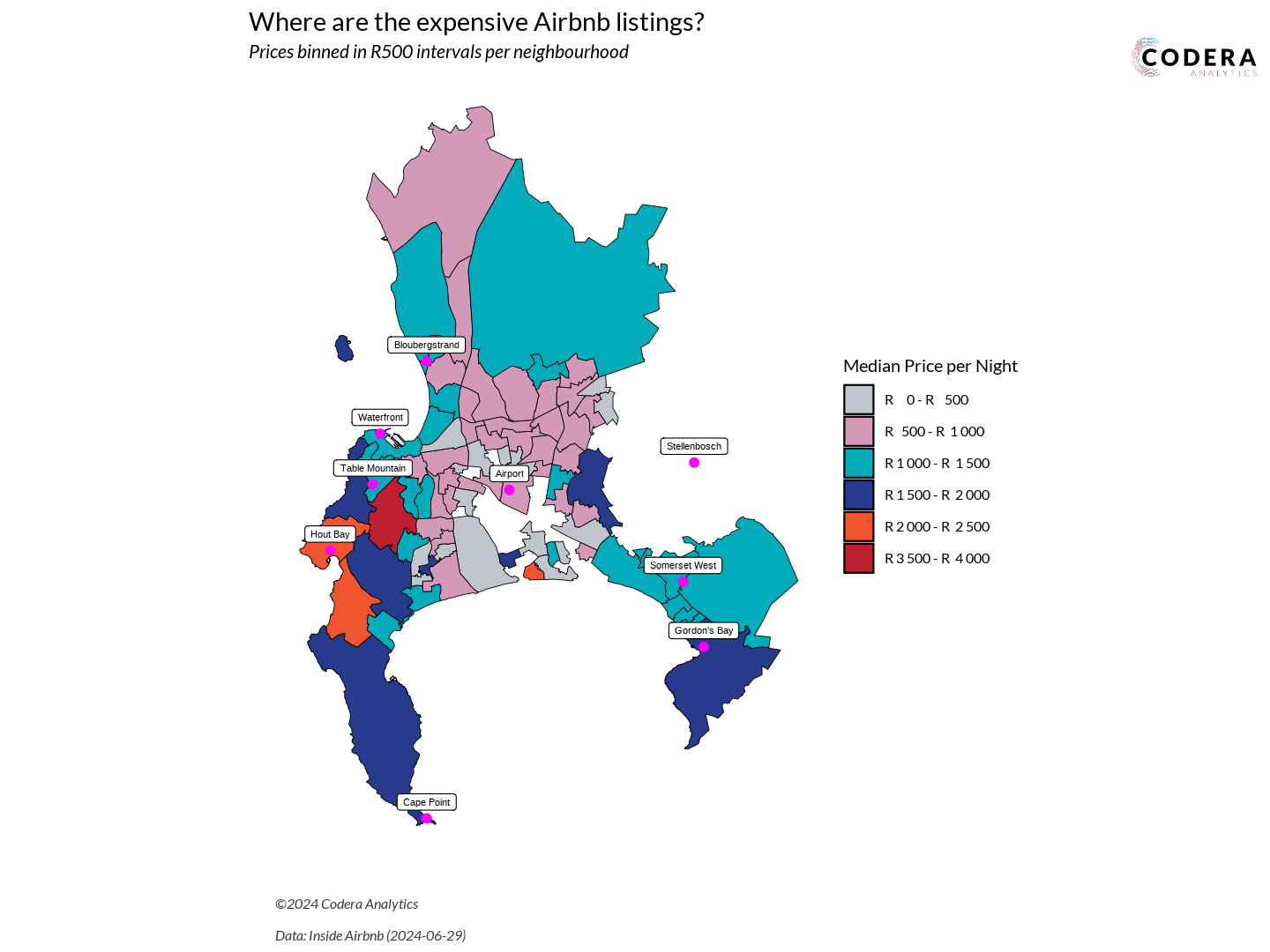
Analyzing the mean price per night for Cape Town’s suburbs was one of the first plots I created this year, back in August. I’m highlighting this plot because it was the one that made me realize I needed a better way to structure my projects. With many plots planned for the year, my workflow needed to be as efficient and seamless as possible – smooth as butter!
I conducted extensive research to find the best practices for organizing projects. I wanted to know what worked well for other analysts and what the recommended folder structures were. Luka Negoita and Chris offered a structure that worked perfectly for me. It included folders for data, output, scripts, and temp files.
Kasia Kulma emphasized the importance of naming files with numbers and avoiding spaces. This approach helps sort files in the desired order and makes it easier to use tools like grep to search for files.
Cecina Babich Morrow wrote an excellent blog post on adding Google Fonts to graphs, which significantly improved the visual appeal of my plots. Lastly, Valentin Stefan provided a clear guide on embedding images into plots, a technique that has been incredibly useful.
I ended with a folder structure that looks something like this:
.
└── my-awesome-project/
    ├── data/
    │   ├── processed/
    │   │   ├── 01_categorical_variables.rds
    │   │   └── 02_categorical_counts.rds
    │   └── raw/
    │       └── board_games.csv
    ├── docs/
    │   └── images
    ├── output/
    │   ├── data/
    │   │   └── 02_categorical_counts.csv
    │   └── plots/
    │       └── 01_categorical_plot.png
    ├── renv
    ├── src/
    │   ├── resources/
    │   │   └── logo.png
    │   ├── utils/
    │   │   ├── 01_theme.R
    │   │   └── 02_save-and-load.R
    │   ├── 00_renv.R
    │   ├── 01_library-import.R
    │   ├── 02_config.R
    │   ├── 10_data-cleaning.R
    │   └── 20_data-visualization.R
    ├── temp/
    │   └── EDA.Rmd
    ├── .gitignore
    ├── .Renviron
    ├── .Renviron-example.txt
    ├── LICENSE
    ├── main.R
    ├── my-awesome-project.Rproj
    ├── README.md
    └── renv.lock
My r-project-template repository provides an in-depth explanation of how the folder structure works. This structure has served me well throughout the year. While I have some ideas on how to refine it for 2025, that’s a topic for another blog post!
If you like visualizing folder structures as tree diagrams, I highly recommend bookmarking https://tree.nathanfriend.io. It’s such a fantastic tool!
Now, let’s get back to the data. There’s a very useful website called Inside Airbnb. According to the site, “Inside Airbnb is a mission-driven project that provides data and advocacy about Airbnb’s impact on residential communities.” You can visit Inside Airbnb to access comprehensive Airbnb data for any city!
For my project, I focused on Cape Town. Each city dataset includes three types of CSV files:
listings.csvreviews.csvneighborhoods.csv
Downloading the data was straightforward and required only a simple script:
data_date <- "2024-06-29"
airbnb_location <- "south-africa/wc/cape-town"

listings_filename <- "listings.csv.gz"

generate_airbnb_link <- function(location, date, file){
  paste0("https://data.insideairbnb.com/", airbnb_location, "/", date, "/data/", file)
}

listings_download_link <- generate_airbnb_link(airbnb_location, data_date, listings_filename)
if (!file.exists(file.path(DATA_RAW_DIR, listings_filename))){
  message("Downloading listings data...")
  download.file(listings_download_link, file.path(DATA_RAW_DIR, listings_filename))
}

reviews_raw <- read_csv(file.path(DATA_RAW_DIR, reviews_filename))
save_to_processed(reviews_raw, "reviews_raw")
I immediately noticed a file type I hadn’t seen before: .*geojson. Upon opening it, I realized it was simply a JSON file. Here’s a small extract:
{
    "type": "FeatureCollection",
    "features": [
        {
            "type": "Feature",
            "geometry": {
                "type": "MultiPolygon",
                "coordinates": [
                    [
                        [
                            [
                                -73.773239,
                                42.683403
                            ],
                            [
                                -73.771874,
                                42.682741
                            ]
                        ]
                    ]
                ]
            },
            "properties": {
                "neighbourhood": "Ward 86",
                "neighbourhood_group": null
            }
        }
    ]
}
By the way! Warning! Don’t open that file in VS Code. If you try to format it, it will create a json file with over 200 000 rows. Rather use jsoneditoronline.org. But how does it connect to the listings.csv? I began exploring the columns in the dataset and noticed a neighbourhood column containing ward names.
neighbourhood
Ward 57
Ward 61
Ward 23
Ah! That matched what was in the geojson file. It’s essentially a shapefile, and they’ve made it super accessible. This was my chance to finally create a Choropleth Map.
Step 1 was downloading and reading the shapefile using the sf package. However, the shapefile was still treated as a foreign object and needed to be converted to an sf object to work seamlessly with the geom_sf layer.
tmp_geojson <- tempfile(fileext = ".geojson")
download.file(
  "https://data.insideairbnb.com/south-africa/wc/cape-town/2024-06-29/visualisations/neighbourhoods.geojson",
  tmp_geojson
)

cpt_sf <- read_sf(tmp_geojson) %>%
  select(-neighbourhood_group)
To handle this, I followed a guide from a book and a helpful Stack Overflow thread.
locations_sf <- locations %>%
  st_as_sf(
    coords = c("long", "lat"),
    crs = st_crs(cpt_sf)
)
Once the conversion was complete, I could finally left_join the shapefile data with my listings.csv dataset.
geo_plot_median_prices <- listings_cleaned %>%
  group_by(neighbourhood_cleansed) %>%
  summarise(
    median_price = median(price)
  ) %>%
  ungroup() %>%
  left_join(
    cpt_sf,
    by = c("neighbourhood_cleansed" = "neighbourhood")
  ) %>%
  select(-neighbourhood_cleansed) %>%
  ...
Creating the price bins was also a whole other story!
How far will R100 get your VW Polo in SA?
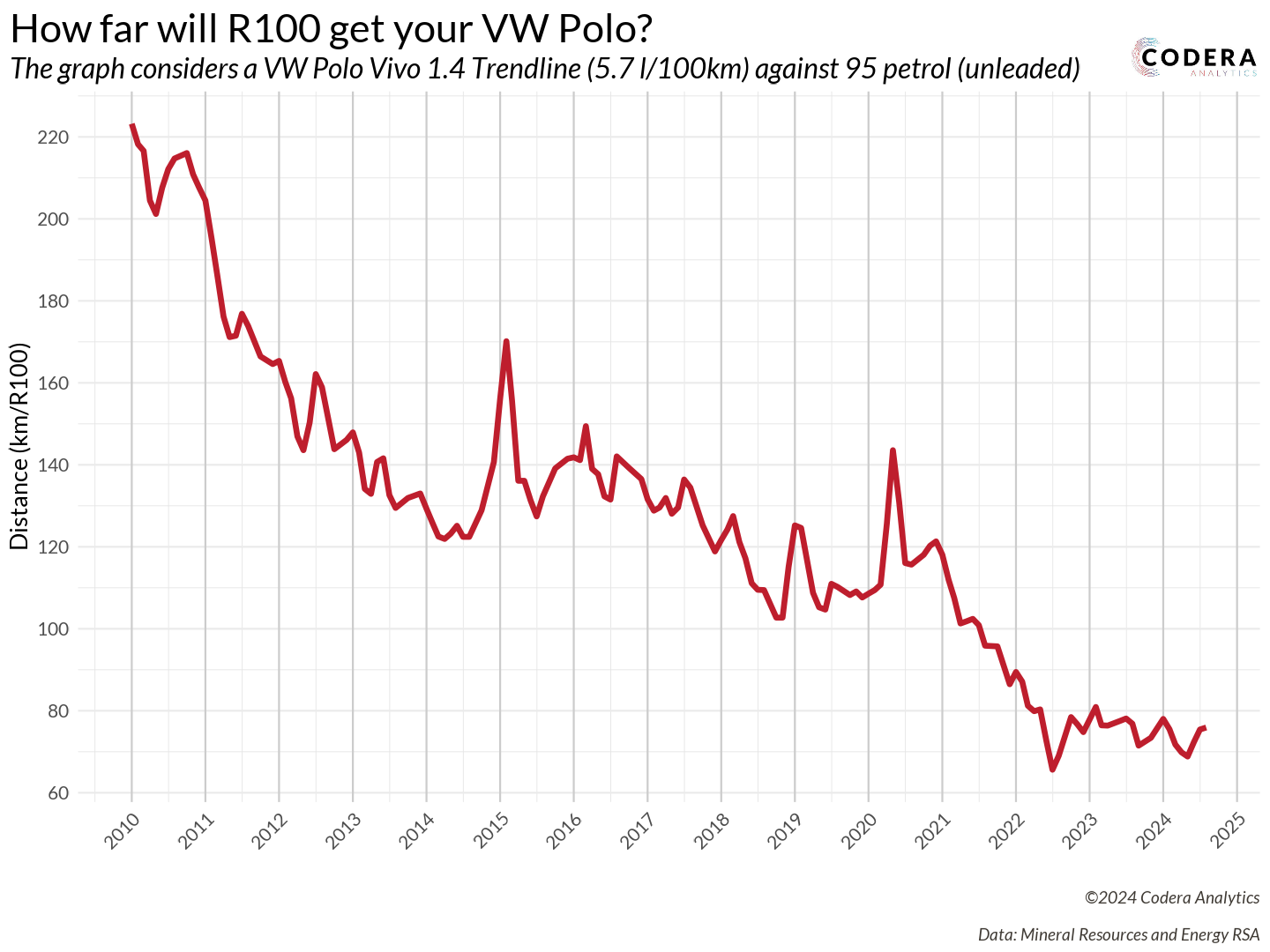
While surfing the web, as one does, I stumbled upon a fascinating News24 article by Robin Classen from 2018. The title immediately caught my attention: “On your last R100 and worried about the fuel price? Here’s how far SA’s most popular fuel-sipping cars will take you.”
It got me thinking! The article presented fuel prices for multiple cars in a single year. But what if I flipped the perspective – analyzing prices for multiple years and focusing on a single car? I think we all know the answer to this plot’s hypothesis: “The R100 will take you less and less distance over time.” But the real question was, by how much? How far could R100 have taken me back in 2010?
The plot required tackling two key components:
- Gathering the fuel price data
- Choosing a car and determining its fuel economy
With that in mind, I headed to the Department of Mineral Resources and Energy’s (DMRE) website to find the data. The DMRE maintains all the basic fuel price reports in their archive. However, I ran into a major hurdle: all the fuel price data was in PDF table format. There’s an example from 2024: Basic Prices 2024
To make matters worse, these weren’t just ordinary tables – they were 3D tables. Parsing these tables was a headache because their column structures were inconsistent across different PDFs. Why? Some PDFs used entirely different 3D table styles. And when building a script to process data over multiple years, there’s one thing you absolutely need: consistency!
It was time to pull out my regex license. To be fair, I’d call it a learner’s permit, but thankfully regex101.com never lets me down! For instance, the pride and joy of this project was crafting this pattern:
float_with_space_as_thousands_regex <- "\\d+\\s+\\d+\\.\\d+"
float_without_space_as_thousands_regex <- "\\d+\\.\\d+"
float_regex <- paste0(
  float_with_space_as_thousands_regex,
  "|",
  float_without_space_as_thousands_regex
)
I know it’s simple, but the excitement was the same as doing your first successful reverse park! Learners permit, remember?
For those wondering, I used tabulapdf to read the PDFs as best I could. Like I said… the inconsistent PDFs made life terrible! The R code was so ugly to read. Here’s a small portion of the script that read in the table and cleaned some of the data.
  # ====> Clean the data
  result <- tabula_result %>%
    # Join all the columns (number of columns returned is unreliable, so we make our own)
    unite(
      "joint",
      num_range("X", 1:ncol(tabula_result)),
      sep = " "
    ) %>%
    # Now only consider the rows which has the valid months
    filter(
      str_detect(joint, valid_months_regex)
    ) %>%
    # (1) Now extract the month from the singular column
    # (2) Build a date -- assume beginning of the month
    # (3) Remove the NAs. These are caused by the irritating 3D tables
    # (4) Create a list of all the decimals
    # (5) Use parse_number to make them numeric
    mutate(
      raw_month = str_extract(joint, valid_months_regex),
      date = dmy(paste0("01-", raw_month, "-", year)),
      joint = str_replace_all(joint, "NA", ""),
      y = str_extract_all(joint, float_regex),
      y = map(
        y,
        ~parse_number(
          .,
          locale = locale(decimal_mark = ".", grouping_mark = " ")
          )
        )
    ) %>%
    # Remove those where the column size is not as expected!
    filter(sapply(y, function(x) length(x) == 7 | length(x) == 8)) %>%
    # Unnest the list in a wide format
    unnest_wider(y, names_sep = "_") %>%
    # Remove temp columns
    select(-joint, -raw_month)
With the basic fuel prices in hand, I had all the data I needed. Now for the toughest question: which car represents the entire population of South Africa? Back to Google!
In 2022, 74% of Volkswagen vehicles sold in South Africa were the Polo Vivo, Polo, or T-Cross. Leading the pack was the Polo Vivo with 20,866 units sold, followed by the Polo at 15,697 units, and the T-Cross at 10,384 units (Volkswagen Newsroom). Since its debut in 2010, the Polo Vivo has consistently been South Africa’s top-selling passenger vehicle, with over 425,000 units sold nationwide (BusinessTech).
For this analysis, the Polo Vivo emerged as the most representative car. The official spec sheet lists the Polo Vivo 1.4 55 kW Trendline with a combined fuel consumption of 5.7 l/100km. While other sources suggest slightly higher figures, the Trendline seems to be the most popular model and thus the most credible choice for this analysis.
Combining all the data and insights resulted in a truly satisfying plot! Back in 2010, R100 could take you an impressive 220 km. Fast forward to today, and that same R100 will only get you about 80 km.
One limitation of this plot is that it doesn’t account for inflation—fuel prices aren’t CPI-adjusted. But hey, that’s a great exercise for readers to tackle on their own!
Which lotto number should you pick?
The national lottery fascinates me. While I don’t think I’ll ever play it, the data behind it is incredibly intriguing! Many websites focus on draw frequencies and patterns, such as:
But I’m more curious about the financial aspect:
- How many winners are there?
- What are the payouts?
- How do rollovers evolve over time?
- Is there a clear “money-in, money-out” dynamic?
It’s no secret that many South Africans play the lottery, making these questions even more relevant. Some stats paint a fascinating picture:
- Over 60% of players come from households earning less than R10,000 a month (IOL).
- Nearly 28% of players are unemployed (IOL).
- Seven out of 10 South Africans reportedly play the lottery regularly (NLCSA).
Now, onto the exciting part—getting historical lottery data was a happy accident! I had often marveled at the data on the National Lottery Results page, knowing the Lotto has been running since 2015. With results published every Wednesday and Saturday, I thought scraping all that data would require a hefty Selenium script.
But then, a lightbulb appeared! While refreshing the page, I opened the browser’s network tab and noticed an intriguing POST request.
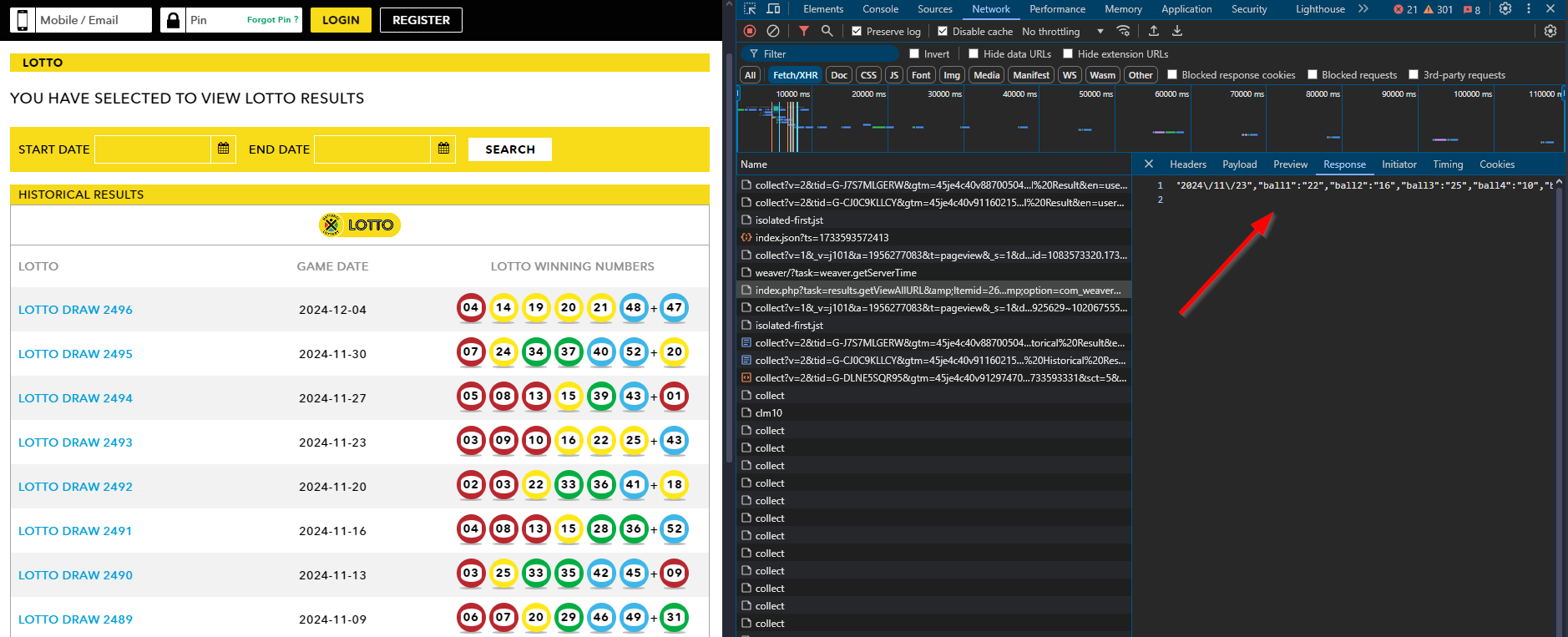
This single request returned everything: winning numbers, ticket sales, payouts, and even YouTube links to the draws. It even included the machine used to draw the winning numbers! Here’s an example of the request:
curl --location 'https://www.nationallottery.co.za/index.php?task=results.redirectPageURL&Itemid=265' \
--form 'drawNumber="2489"' \
--form 'gameName="LOTTO"' \
--form 'isAjax="true"'
To make things even better, there was another request for paginated data:
curl --location 'https://www.nationallottery.co.za/index.php?task=results.getHistoricalData&Itemid=265' \
--form 'gameName="LOTTO"' \
--form 'startDate="01/01/2024"' \
--form 'endDate="10/11/2024"' \
--form 'offset="0"' \
--form 'limit="51"' \
--form 'isAjax="true"'
With these scripts, I successfully extracted all the lottery data! You can check out my Ithuba-National-Lottery-Historic-Data repository to see it in action. Using Python’s ThreadPoolExecutor, the script processed data lightning fast, gathering results from all 975 draws dating back to 2015/06/03.
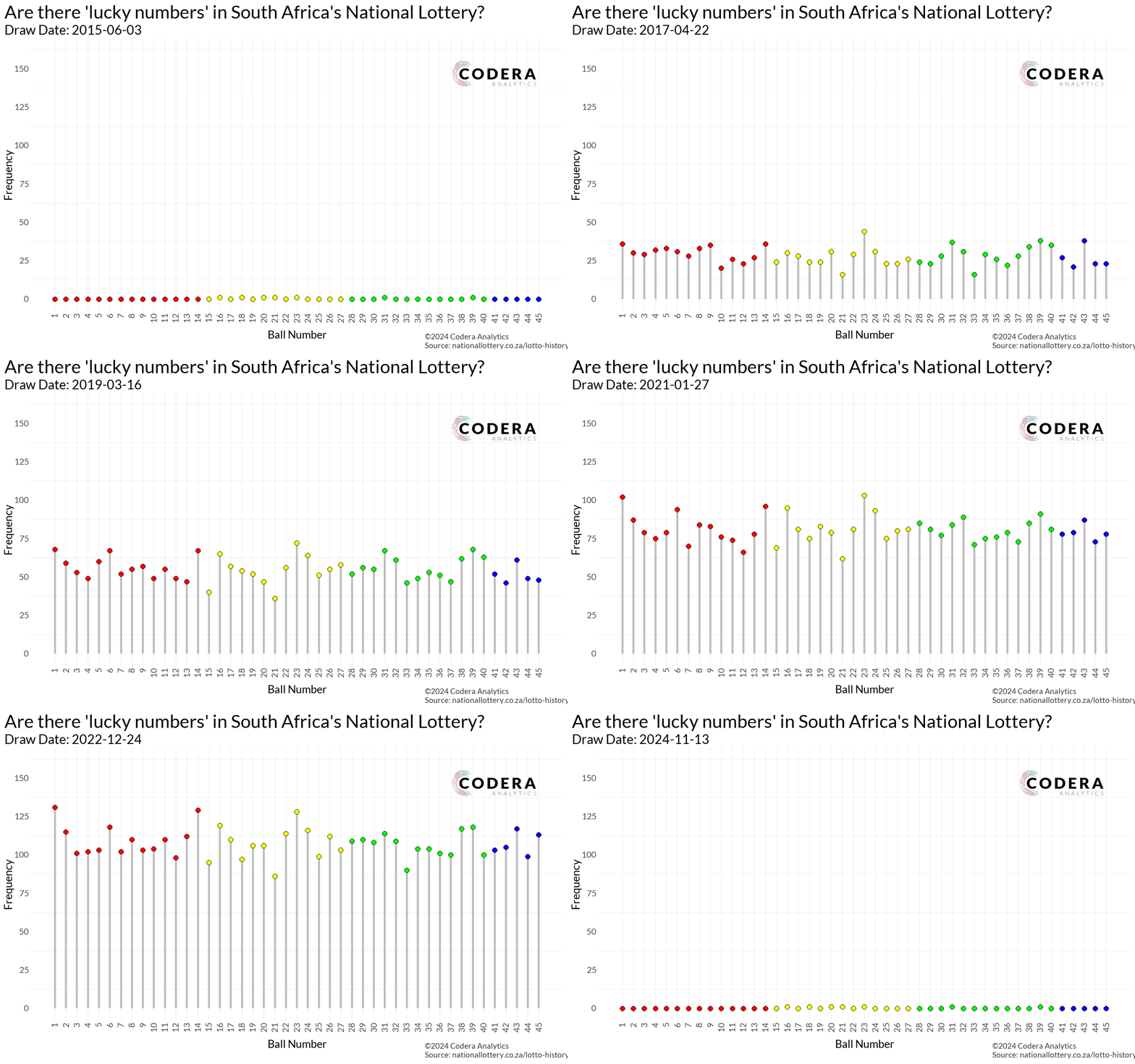
Great! I had all the data… but now what? It felt like a classic “dog chasing the car” moment. I had caught the data, but I had no idea what to do with it. After some brainstorming, inspiration struck: Are there really lucky numbers?
My first thought was to create a lollipop plot to visualize how often each number (1–45) had been drawn. While the plot looked clean and informative, it didn’t excite me.
While making coffee, a new idea hit me: What if I brought time into the equation?
Animating the data would allow us to see the numbers “racing” each other over time, creating the same excitement I felt watching the Marble Olympics back in my university days.
The Plan: to animate this, I needed a massive data frame where:
- Columns represented the numbers (1–45).
- Rows represented draw dates.
With this structure, I could calculate cumulative counts for each number over time. The animation would then show each number “racing” to the top as they were drawn.
For the visualization itself, I used a geom_segment for each lollipop stem, with points at the tips to represent the count for each number at a specific time:
  geom_segment(aes(
    x = ball_number,
    xend = ball_number,
    y = 0,
    yend = frequency
  ),
  color = "grey",
  size = 2
)
By using gganimate, the animation seamlessly illustrated the progression of these counts, making the story of “lucky numbers” dynamic and visually engaging:
  transition_states(
    draw_date,
    transition_length = 4,
    state_length = 1
  ) +
  enter_grow() +
  exit_shrink() +
  ease_aes('cubic-in-out')
Do JSE Top 40 companies talk more about profits or sustainability?

Don’t let these two simple lines deceive you – this was the most tedious data collection I undertook in 2024. I manually searched for and downloaded over 250 integrated annual reports – that’s 40 JSE companies across seven years. The biggest frustration? Each company had its own unique way of publishing and archiving these reports. Some files were small, while others were absolutely massive – some even exceeded 70 MB! It took me two weeks to download all these reports. To save others from this hassle, I uploaded all of them to my JSE-Top-40-IAR repository. Keep in mind that the JSE Top 40 is subject to change; this dataset reflects the top 40 companies as of November 2024.
Why go to all this trouble to collect these PDFs? My motivation came from two sources:
- David Robinson’s Influence
I’m a huge fan of David Robinson – he’s my data science role model! A few years ago, he created a video series analyzing data from the TidyTuesday initiative. What made it special was that he didn’t prepare in advance. He would analyze the data live, allowing viewers to observe his thought process and problem-solving methods for cleaning data. I still frequently revisit those videos.
Anyway, David co-wrote a book and R package with Julia Silge called Text Mining with R. Ever since reading it, I’ve been eager to find an excuse to perform text analysis in R. - Morning Brew’s Spark
I love reading Morning Brew newsletters. One of their articles piqued my curiosity—they discussed the recession in America and how S&P 500 companies had stopped mentioning it in their integrated annual reports. How did they know that? Where did they get the data? This inspired me to analyze the same for our JSE Top 40 companies. Finally, I had a reason to dive into text analysis in R!
Even though R is one of the best languages for data analytics, it struggles with tasks outside that scope. When I attempted to extract text from these PDFs, my editor would crash or freeze, especially when dealing with those massive 70 MB reports! While the PDFs are great for printing, they’re a nightmare for R.
To overcome this, I had to use an intermediary. I wrote a quick Python script to extract text from the PDFs using the PyMuPDF package and save the output as txt files in a separate folder. R can at least handle plain text files!
Here’s how easy it is to extract text from a PDF using PyMuPDF:
import fitz  # PyMuPDF library
doc = fitz.open("example.pdf")  # Open a PDF document
for page in doc:  # Iterate through each page
    text = page.get_text()  # Extract plain text encoded as UTF-8
This approach saved me from countless crashes and made it possible to process the reports efficiently in R.
Now for the easy part! The tokenization is very easy.
txt_content <- readLines(TXT_FILE_DIR, warn = FALSE)
txt_content <- paste(txt_content, collapse = " ")

temp_df <- data.frame(text = txt_content) %>%
	# Where the mmagic happens!
	unnest_tokens(word, text) %>%
	# An attempt to remove some of the useless tokens
	filter(
	  !grepl("^[0-9]+$", word),
	  !grepl("\\.", word),
	  nchar(word) > 1
	) %>%
	# Remove the stop words
	anti_join(get_stopwords(), by = "word") %>%
	# The actual count of tokens
	count(word, name = "count") %>%
	mutate(
	  year = year,
	  company = company
	) %>%
	select(year, company, word, count)
And then it’s as easy as choosing what word you would like to plot, filter for that word and make a simple line plot!
Which features matter most in vehicle pricing?
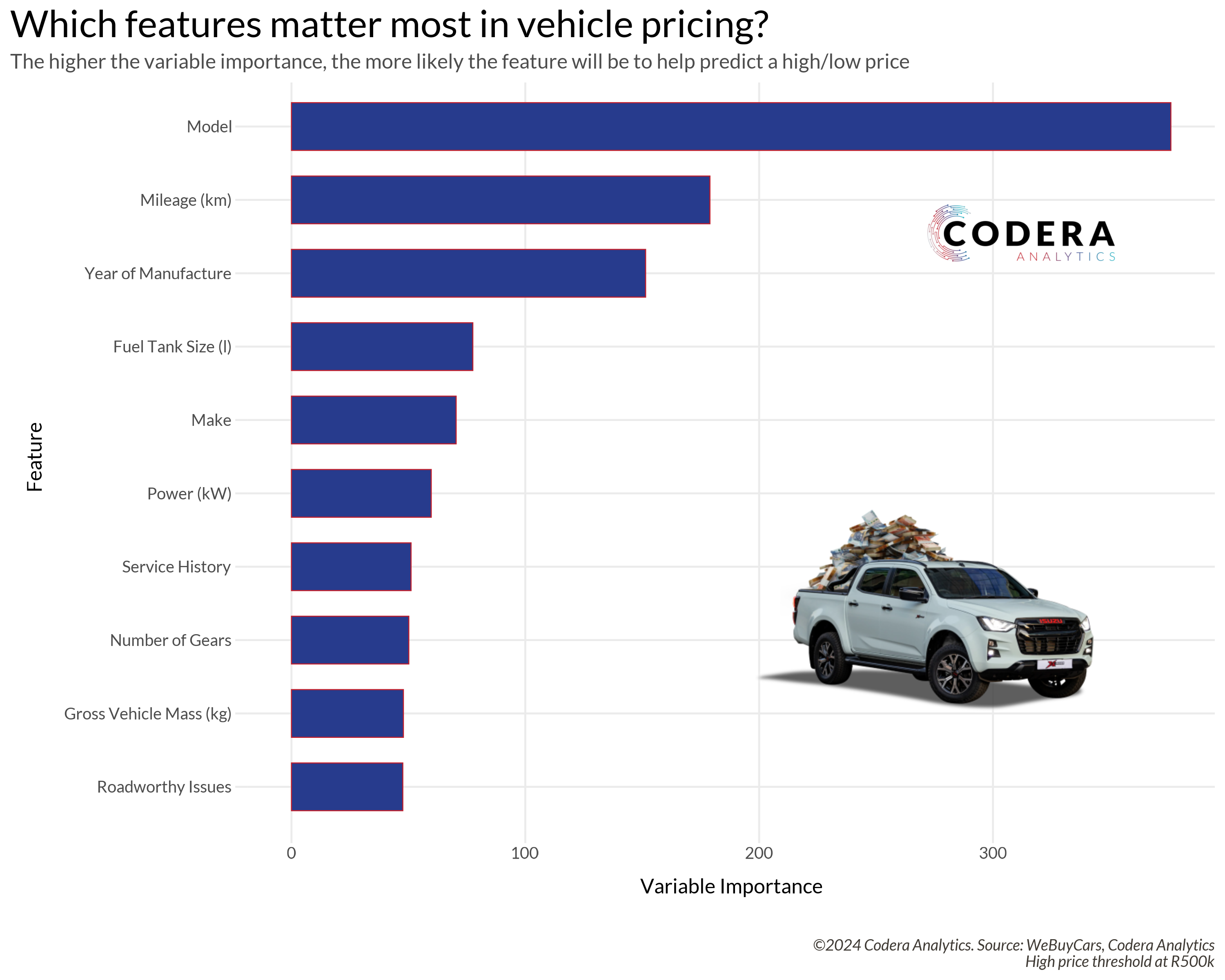
Similar to the lottery data, this was another happy accident. Once again, I found myself exploring the network tab – this time on the We Buy Cars website. After downloading data for over 10,000 car listings, one thing stood out: the sheer number of columns available. Each listing had over 115 variables, ranging from model, make, and year to engine_cycle, mileage, and my personal favorite, has_spare_key.
During a standup that week, I mentioned all the columns in the dataset, which sparked an interesting question from the team: “What drives the price? Which features result in higher prices?”
This sounded like the perfect use case for analyzing variable importance using decision trees. If you’re wondering, “What exactly is a decision tree?” let me introduce you to Josh Starmer. He explains even the most complex models in simple, layman-friendly terms!
When it comes to building machine learning models, my go-to toolkit is the tidymodels ecosystem. It’s thoughtfully designed with four key steps:
- Build a model
- Process your data with recipes
- Evaluate your model with resampling
- Tune model parameters
Their documentation is exceptional – one of the most user-friendly resources you’ll find online.
Now, onto the design decision: what would my predictor be? The ultimate goal was to determine what drives the price, but since price is a numeric variable, this would require creating a regression decision tree. However, I strongly prefer classification decision trees as they’re much easier to analyze.
To simplify the problem, I decided to introduce a threshold. Cars priced below R500K would be classified as “low value,” while those above R500K would be considered “high value.” This binary classification allowed me to predict whether a car had a low or high value and then extract the variable importance.
An interesting by-product of this approach is its flexibility: the threshold can be adjusted based on the user’s definition of “expensive.” For example, if someone considers a car above R150K as high value, the same methodology can be used to identify what’s most important to them.
The first step was to explore the dataset. While not an official acronym, I performed a “KYD” – short for “know your data.” There was a fair bit of missing data.
df_cars_for_sale %>%
  mutate(across(where(is.character), ~ na_if(., ""))) %>%
  summarise(across(everything(), ~ mean(is.na(.)) * 100)) %>%
  pivot_longer(cols = everything(),
               names_to = "column",
               values_to = "missing_percentage") %>%
  arrange(desc(missing_percentage))
The dataset also had a sufficient balance between “high value” and “low value” classifications available. Now on to the well-known process of building a model.
First, we split the dataset into a training and testing set:
data_split <- initial_split(df_cars_for_sale, prop = 0.8, strata = price_category)
train_data <- training(data_split)
test_data <- testing(data_split)
Then we define a recipe where we try to address all the missing data. I performed an imputation using the mean of the numeric variables and the mode of all non-numeric variables:
recipe <- recipe(price_category ~ ., data = train_data) %>%
  step_impute_mean(all_numeric()) %>%
  step_impute_mode(all_nominal_predictors())
And now we prepare the recipe!
prepared_recipe <- recipe %>% prep()
My favorite function! We bake the recipe into the training data. This allows us to see exactly how the data is being transformed:
train_cleaned <- bake(prepared_recipe, new_data = train_data)
glimpse(train_cleaned)
Now, we specify the model we want to make. For this project, I used a classification decision_tree with the rpart engine. All parameters were set to tune() to allow for hyperparameter optimization:
tree_spec <- decision_tree(
  cost_complexity = tune(),
  tree_depth = tune(),
  min_n = tune()
) %>%
  set_engine("rpart") %>%
  set_mode("classification")
Right! We’re ready to start building! One last step is to define the workflow for how each model is constructed:
workflow <- workflow() %>%
  add_recipe(recipe) %>%
  add_model(tree_spec)
As I mentioned before, we don’t want to overfit or underfit the model. We need to find that sweet spot between bias and variance. One way to do this is by trying various parameters—this process is called hyperparameter tuning. I won’t go into too much detail about how and why we create the folds, but trust that it’s a critical part of the process.
For tuning, I considered the following parameter ranges. These are slightly expanded from the defaults, which usually work well:
cost_complexity_tune_range <- c(0.0001, 0.001, 0.01, 0.1)
tree_depth_tune_range <- c(3, 4, 5, 7, 15)
min_n_tune_range <- c(5, 10, 15, 20)
num_folds <- 4
Next, I created the grid (all possible parameter combinations) and defined the tuning grid using the folds:
grid <- expand_grid(
  cost_complexity = cost_complexity_tune_range,
  tree_depth = tree_depth_tune_range,
  min_n = min_n_tune_range
)

res <- tune_grid(
  workflow,
  resamples = vfold_cv(train_cleaned, v = num_folds),
  grid = grid,
  control = control_grid(verbose = TRUE)
)
The tune_grid process takes a long time to run, but the results are always worth it! Once training is complete, we can evaluate the parameter performance:
# Makes a plot
autoplot(res, metric = "roc_auc", type = "marginals")

# Allows us to see the table
collect_metrics(res)
Cool! We can extract the best model parameters using the roc_auc metric and set them in the final workflow:
best_params <- select_best(res, metric = "roc_auc")
final_workflow <- finalize_workflow(workflow, best_params)
And voilà! The final model is ready to be built:
tree_model <- fit(final_workflow, data = train_data)
Phew! That was a lot of steps. I really need a coffee now. Next, we’ll extract the variable importance. But before that, how good is our model? Variable importance doesn’t mean much if the model itself isn’t good.
Let’s make predictions and calculate some evaluation metrics:
predictions <- predict(tree_model, new_data = test_data) %>%
  bind_cols(test_data %>% select(price_category))
With “high classifications” as the positive class, the results are as follows:
- Sensitivity: 69%
- Specificity: 96%
- Kappa: 0.6112
The model demonstrates very high specificity, meaning it’s excellent at predicting low values. Sensitivity, at 69%, is also reasonable. Sensitivity (or recall/true positive rate) is especially crucial for medical applications. For example, in cancer detection models, misclassifying a positive case can have life-threatening consequences. In such cases, sensitivity is the most important metric to optimize.
But what metric is most useful for decision trees? Kappa! Kappa is an excellent performance metric for unbalanced datasets. It measures whether a classifier performs better than one that guesses randomly based on class frequency. A negative Kappa value is bad—it means you’d get better results by flipping a coin. Positive values are what we aim for!
Landis and Koch provided this helpful table for interpreting Kappa values:
| Kappa Statistic | Strength of Agreement |
|---|---|
| < 0 | Poor |
| 0 - 0.2 | Slight |
| 0.21 - 0.4 | Fair |
| 0.41 - 0.6 | Moderate |
| 0.61 - 0.8 | Substantial |
| 0.81 - 1 | Almost perfect |
Given that our model achieves a Kappa value within the “substantial agreement” range, I feel confident in its performance.
And finally, we can extract the variable importance data
vi_data <- vi(tree_model$fit$fit)
Conclusions
Even though I only started creating plots in August, 2024 was a busy year in data and analytics. I learned so much from my peers and benefited from incredible mentorship along the way. I’m excited to see what kinds of plots I’ll create in 2025. Thank you, 2024!