Making a Dashboard for South Africa's Dam Data
Two blog posts ago, I wrote some code to self-host any Streamlit app I throw into a root folder – each with its own route and virtual environment. Then, in my most recent post, I set up a scheduled Lambda function to scrape dam data from the Department of Water and Sanitation.
And now, it’s all led up to this moment: the dam dashboard I’ve been dreaming of building.
I put together a little demo of what’s possible! Have a look at the video above. As you can see, you can:
- View all available dam data from the Department of Water and Sanitation’s website, including the dam name, the river that feeds it, its capacity, the percentage filled, and how it changed compared to last week.
- Sort and search the table.
- View the table in fullscreen.
- Download the data as a CSV.
- Apply filters, such as report date or province. The script runs every Thursday, giving the department enough time to upload the latest data.
- Browse an interactive map with all the dams. They’re color-coded based on their status (as defined by the department), and their size is relative to their capacity. Clicking a dam shows its name and fill percentage.
This is all thanks to Streamlit – it makes building web apps ridiculously easy. Check out my first post in the series if you haven’t yet.
Have a look at the dashboard for yourself! 🚀
🔗 https://dash.happybread.net/dam/
👨🔬 Architecture
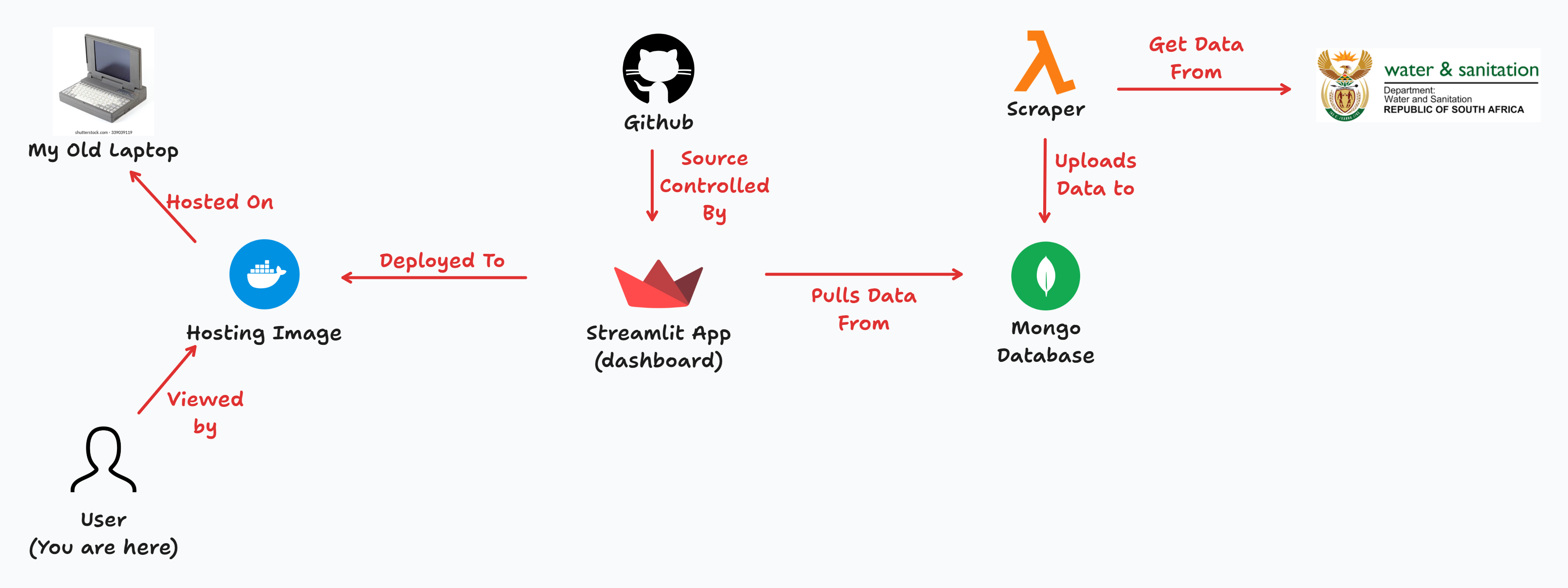
I’ve already covered how I set up the Docker image and the Lambda scraper. Now, here’s the full picture of how all the services come together:
- The scraper runs every week, pulling the latest data and uploading it to a MongoDB database. It’s important not to use a serverless DB… since we’re expecting some traffic, I don’t want to end up with a huge bill from all the queries.
- The Streamlit app fetches data from this database based on the filters set by the user.
- I push my codebase to GitHub and use Git submodules to pull the app into the Docker image.
- I then rebuild the image. Keep in mind, this is still running on my old laptop – so if traffic spikes, you’ll definitely feel it! 😅
🐍 Dive into the Code
We want users to have some filter power™. But first, we need to figure out what filter options to present. What should the defaults be? And of course, we need an “All” option – because we believe in giving users control!
Enter the get_filter_options function. It has one job: get the filter options! Haha.
The report_dates will be a List of datetime.datetime objects, while provinces will be a List of province names (str). Looking back, provinces could have been a static list – I totally agree! 🤦♂️ But hey, if a new province ever pops up, I’ll be ready!
report_dates, provinces = get_filter_options()

report_date: datetime.datetime = st.sidebar.selectbox(
    label="Select Report Date",
    options=["All"] + report_dates,
    index=1 if get_latest_report_date() in report_dates else 0
)

province: str = st.sidebar.selectbox(
    label="Select Province",
    options=["All"] + provinces
)
Note that the st.sidebar.selectbox for the report_date always chooses the latest date as the default. That way, when the dashboard loads, You’ll always have the latest data for “All” the provinces
Let’s have a look at get_filter_options:
@st.cache_data(ttl="600s")
def get_filter_options() -> Tuple[List[datetime.datetime], List[str]]:
    reports: pymongo.synchronous.collection.Collection = client['dam-dash']['reports']

    report_dates: List[datetime.datetime] = sorted(
        reports.distinct("report_date"),
        reverse=True
    )

    provinces: List[str] = sorted(
        reports.distinct("province")
    )

    return report_dates, provinces
I make use of the distinct method to retrieve a list of all available report dates (report_date) and provinces (province).
Also, notice how I’m using st.cache_data to cache the result of this query. This is a crucial building block in Streamlit. Every time you change the state of the app (for example, choosing a new filter option), the whole main Python script runs from top to bottom. So you really need to be smart about handling computationally expensive tasks like querying a database.
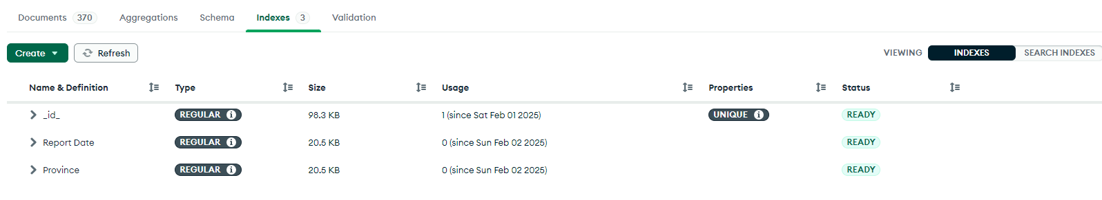
One last note: I also added two indexes to the MongoDB database. Since we’ll be querying these two fields the most, it’s best to have the indexes ready for the day when we have too much data!
⚡ Connecting to the database and fetching data
Now we can fetch some data! To keep the user engaged while fetching, we’ll display a spinner. The get_data function will pull data from MongoDB and return a pandas DataFrame (pd.DataFrame) for later use.
Pandas is a large Python package, and I don’t normally install it. BUT since it comes pre-installed as a dependency in Streamlit, we might as well take advantage of it!
with st.spinner('Fetching data...'):
    data: pd.DataFrame = get_data(
        report_date=report_date,
        province=province
    )
Let’s look at the function:
TABLE_COLUMNS = {
    "dam": "Dam Name",
    "province": "Province",
    "river": "River",
    "full_storage_capacity": "FSC Million m³",
    "this_week": "Pct Filled",
}

@st.cache_data(ttl="20s")
def get_data(
    report_date: datetime.datetime,
    province: str
) -> pd.DataFrame:
    query: Dict[str, Union[datetime.datetime, str]] = {}

    if report_date != "All":
        query["report_date"] = report_date
    if province != "All":
        query["province"] = province

    items: List[Dict] = list(client['dam-dash']['reports'].find(
        filter=query,
        projection={k: 1 for k in TABLE_COLUMNS.keys()} | {"lat_long": 1, "last_week": 1}
    ))

    df: pd.DataFrame = pd.DataFrame(items)

    # Rename columns for user-friendly display
    df.rename(columns=TABLE_COLUMNS, inplace=True)

    # Convert full storage capacity to million cubic meters
    df[TABLE_COLUMNS['full_storage_capacity']] /= 1e6

    # Compute percentage change
    df["Change"] = df.apply(
        lambda row: (
            f'🔼 {row["Pct Filled"] - row["last_week"]:.1f}%' if row["Pct Filled"] > row["last_week"]
            else f'🔻 {row["Pct Filled"] - row["last_week"]:.1f}%' if row["Pct Filled"] < row["last_week"]
            else '◼ 0%'
        ), axis=1
    )

    # Drop "last_week" column (no longer needed)
    df.drop(columns=["last_week"], inplace=True)

    return df
Handling the “All” selection is easy – if the user selects “All”, we don’t filter anything, returning the entire dataset. But if they choose a specific date or province, we add that to the query.
I also created a TABLE_COLUMNS mapping to associate MongoDB field names with cleaner, more user-friendly column names. This makes it easier to:
- Select columns dynamically: Instead of listing every column manually, we use
{k: 1 for k in TABLE_COLUMNS.keys()}in the projection. - Rename columns efficiently: Pandas expects a dictionary in this exact format, so we just pass
TABLE_COLUMNSdirectly!
Finally, I added a “Change” column to show how the dam storage percentage differs from last week, using pd.DataFrame.apply(). To make trends easier to spot at a glance, I added visual indicators:
- 🔼 (up arrow) if storage increased
- 🔻 (down arrow) if storage decreased
- ◼ (neutral square) if there was no change
Displaying the data is super easy. I just pass the data to the st.dataframe method:
with left_column:
st.write("#### Dam Levels Table 📊")
data.sort_values(
by=[
TABLE_COLUMNS['province'],
TABLE_COLUMNS['this_week']
],
ascending=[True, False],
inplace=True
)
st.dataframe(
data[list(TABLE_COLUMNS.values()) + ["Change"]],
hide_index=True
)
# Shameless plug
st.write("[](https://buymeacoffee.com/johanlangman)")
🗺 Making maps with Folium
Okay, so Streamlit does have built-in maps using st.map(), but they weren’t quite what I envisioned. I wanted something with more customization and control, so I decided to use Folium instead!
To create the map, we start by declaring a folium.Map object and then adding circles (folium.CircleMarker) to represent each dam. Finally, we use the streamlit-folium plugin’s st_folium function to embed the map in Streamlit.
Here’s how I created the circles:
PALETTE: List[str] = [
    "#e60000",  # < 25%
    "#ffaa02",  # 25% - 50%
    "#fffe03",  # 50% - 75%
    "#4de600",  # 75% - 90%
    "#0959df"   # > 90%
]

def get_color(value: Union[int, float]) -> str:
    if value < 25:
        return PALETTE[0]
    elif value < 50:
        return PALETTE[1]
    elif value < 75:
        return PALETTE[2]
    elif value < 90:
        return PALETTE[3]
    else:
        return PALETTE[4]

with right_column:
    st.write("#### Dam Levels Map 🌍")

    # =========== // NORMALIZE DOT SIZE // ===========

    min_size, max_size = 6, 15
    min_fsc, max_fsc = data[TABLE_COLUMNS['full_storage_capacity']].min(), data[TABLE_COLUMNS['full_storage_capacity']].max()

    def get_marker_size(fsc):
        return min_size + (max_size - min_size) * ((fsc - min_fsc) / (max_fsc - min_fsc) if max_fsc > min_fsc else 0)

    # =========== // CREATE FOLIUM MAP // ===========

    m = folium.Map(
        location=[-28, 24],  # Centered over South Africa
        zoom_start=6,
        tiles='OpenStreetMap'
    )
    m.fit_bounds([
        [-35, 16.5],  # Southwest corner
        [-22, 33]     # Northeast corner
    ])

    # =========== // ADD CIRCLES TO MAP // ===========

    for _, row in data.iterrows():
        folium.CircleMarker(
            location=row["lat_long"],
            radius=get_marker_size(row[TABLE_COLUMNS['full_storage_capacity']]),
            color=get_color(row[TABLE_COLUMNS['this_week']]),
            fill=True,
            fill_color=get_color(row[TABLE_COLUMNS['this_week']]),
            fill_opacity=0.8,
            popup=f"{row[TABLE_COLUMNS['dam']]} ({row[TABLE_COLUMNS['this_week']]}%)"
        ).add_to(m)

    # =========== // DISPLAY MAP IN STREAMLIT // ===========

    st_folium(
        m,
        height=500,
        use_container_width=True,
        returned_objects=[]  # IMPORTANT! Make it a static plot (no callbacks)
    )
How it works:
- Determine the color
- Each dam’s color is based on its current fill percentage (
this_week). Theget_color()function assigns a color from thePALETTE, where:- Red 🔴 means critically low levels (< 25%).
- Orange 🟠, Yellow 🟡, Green 🟢, and Blue 🔵 indicate increasing levels.
- Each dam’s color is based on its current fill percentage (
- Determine the size
- Each dam’s marker size is proportional to its full storage capacity. The largest dam will have a bigger circle, while the smallest will be smaller, ensuring a clear visual hierarchy.
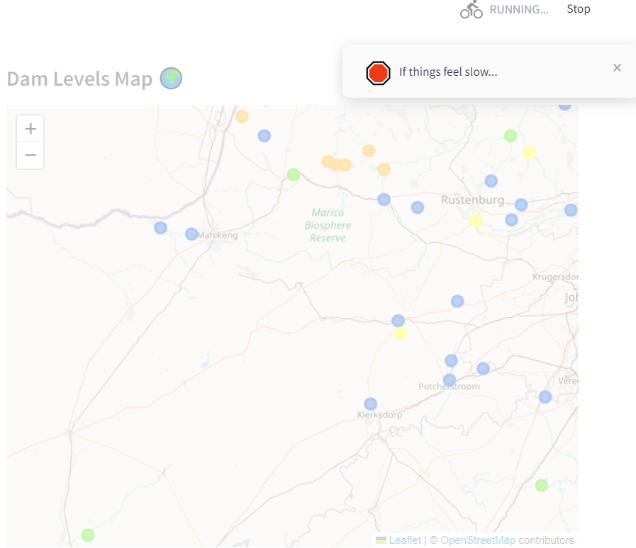
🐣 The Easter egg you actually don’t want to see
Like I mentioned, I’m running this on an old laptop since the cloud is too expensive. So if there is a lot of traffic, the CPU will spike and things will become slow. I have something at the end of the script that checks to see how long it took to run through the whole Python file. If you had to wait more than 10 seconds to get your data, you’ll start to see some toast messages!
if time.time() - start_time > 10.0:
    msg = st.toast('Hi!', icon="🛑")
    time.sleep(3)
    msg.toast('If things feel slow...', icon="🛑")
    time.sleep(3)
    msg.toast('Remember that this is hosted on an old laptop!', icon="🛑")
    time.sleep(3)
    msg.toast('Thanks! And enjoy!', icon="🎉")
It will look something like this!
❓ Conclusion
And that’s it! By combining Folium with Streamlit, we can create an interactive, visually appealing dam levels map with custom colors and proportional marker sizes.
Thanks for reading!
You can have a look at the source code here 🐱